Today we’re talking about cover re-designs for Top Ten Tuesday! We’re all familiar with publishers coming up with new covers for books (probably just to get us to buy more). Anyone else feel my struggles? I mean, they keep coming out with new versions of Harry Potter books I just have to have. Because they’re so pretty! Maybe I should get rid of some other books to accommodate them, but eh. I want to try to read them first.
One of my biggest pet peeves is when publishers create a new version of the cover to match the movie. I get why they do it, but they’re often not better than the original. You can market for the movie in other ways. But I digress! There are definitely still cover re-designs I absolutely love. I’m going to just stick with five this week though, because it takes so long to find covers. 😂
Top Ten Tuesday is a meme that was created by The Broke and the Bookish and is currently run by The Artsy Reader Girl. If you haven’t checked out their posts yet, you definitely should! I’ve been doing them since January and have enjoyed each one. Check out my last one here!
Favorite Cover Re-Designs
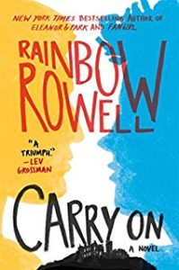
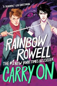
1. Carry On by Rainbow Rowell
I liked the first one, but the second one shows so much more detail! Secretly hoping the second one will come out in hardcover so it’ll match the book coming out this fall.
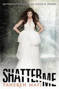
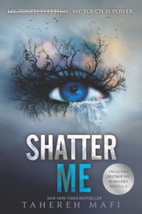
2. Shatter Me by Tahereh Mafi
The eye with the trees is so much more appealing than the girl in the dress. Plus, now all the covers match each other and they look really cool together.
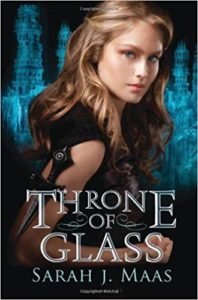
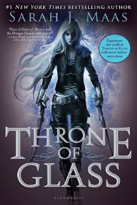
3. Throne of Glass by Sarah J. Maas
Maybe I just don’t like the girl with the dress thing? I like the more modern covers, for sure.
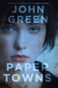
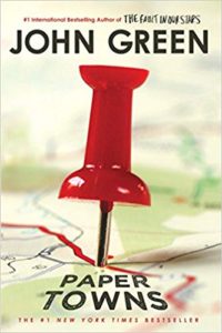
4. Paper Towns by John Green
Another example of me not necessarily liking just the face of a person on the cover. 😂 Oh well. Maybe publishers learned people don’t like them.
5. The Apocalypse of Elena Mendoza by Shaun David Hutchinson
Again, publishers when with a more illustrated cover rather than a picture of a person, and I think it represents the story so much better.




I’m definitely with you on preferring modern covers! I feel like publishers used to be all about just faces on books and that drove me crazy!
Yeah! I was looking through some old covers and there were so many of them! I’m glad they’ve seemed to move away from that.
Yeah, most of us TTT bloggers don’t like film covers for books. There must be a market out there for it somewhere, though, or it wouldn’t happen so often! And that Shatter Me cover is gorgeous. Did you notice how often it was mentioned this week? My post: https://lydiaschoch.com/top-ten-tuesday-summer-covers-i-like
That’s true! I guess generally for people that watch the movie before reading the book. And yes! That was definitely a change for the good. 🙂